My final year degree thesis. Published at last!
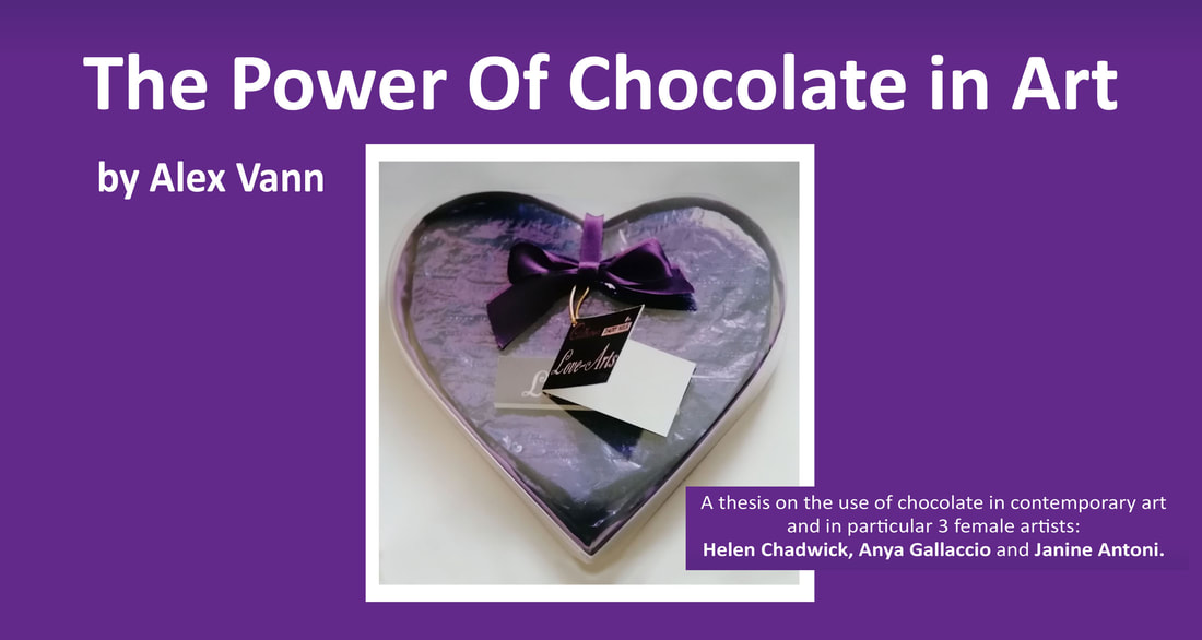
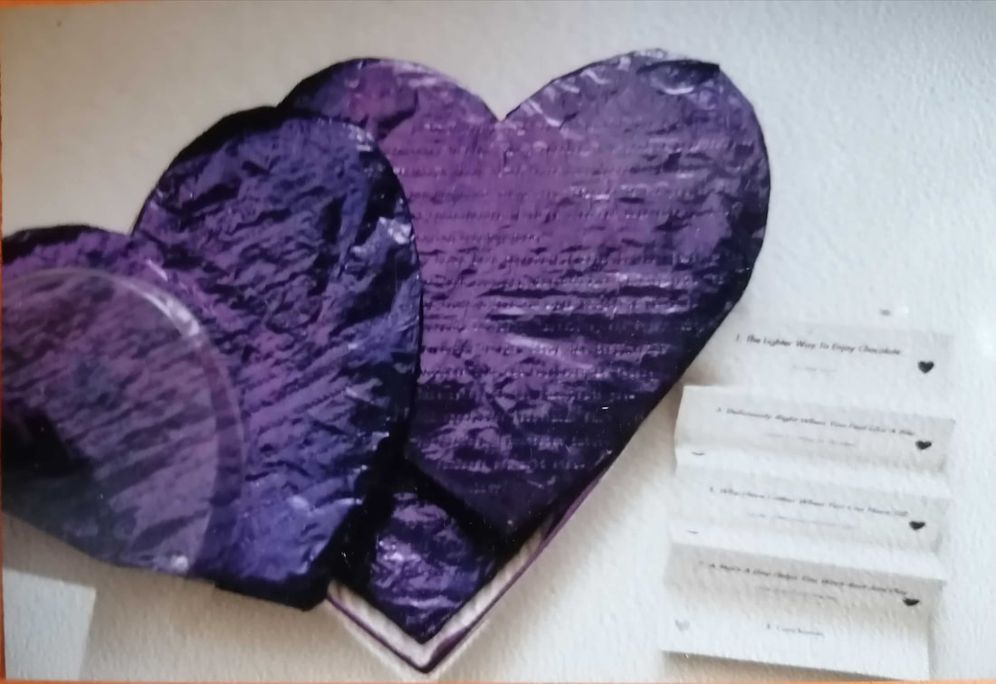
As the course was essentially a graphic design degree, I decided to package the work like a box of chocolates, with a few sample paragraphs typewritten (yes, with a typewriter) onto Cadbury's purple foil which was used to wrap real Dairy Milk chocolate melted into hearts. I did a massive amount of research and looked into the history of chocolate as well as what it meant to modern society in order to contextualise its potency in art and importantly the differences in approach between female and male artists. I hope people find it interesting. It was written a long time ago and as such is very much of its time (please read it with forgiving eyes). However, it's always been close to my own (chocolate) heart: it contributed heavily to getting a first class degree and my tutor at the time said I should publish it. Now, all these years later, I finally have! If you'd like to read the full work, click the 'Issuu' link below: Extract: The Lighter Way to Enjoy Chocolate : |
| Montezuma served his XOCOATL (XOC —cacao, ATLE — water) in finely crafted goblets of precious metals. It was an important celebrated drink, given as reward to valiant soldiers, an energy giving potion, and reportedly a highly potent aphrodisiac. |
Richard Cadbury began the vogue for art in 1868 with his painting of a young girl with a kitten on the lid of one of his boxes. Many Victorian chocolate boxes had important uses after the contents had been consumed. Nowadays, millions of pounds are spent by huge companies on designing and manufacturing chocolate boxes, not to mention advertisements offering the product to the consumer in brightly coloured packages of gold, silver, red, yellow and orange etc.
Because of its nature as a gift, the packaging has traditionally been aesthetically attractive and alluring.
In its use as an artist’s medium, it has been stripped of its packaging and delivered in galleries through means of repetition, layering and bulk.
Dieter Roth often used chocolate and cocoa powder mixed with acrylic paint and glue as a medium. Like Ruscha, he had experimented with foodstuffs for paints. Claes Oldenburg and Joseph Beuys and more recently Paul McCarthy have also used chocolate as paint, usually mixed with something else and as part of a ‘larger picture.’
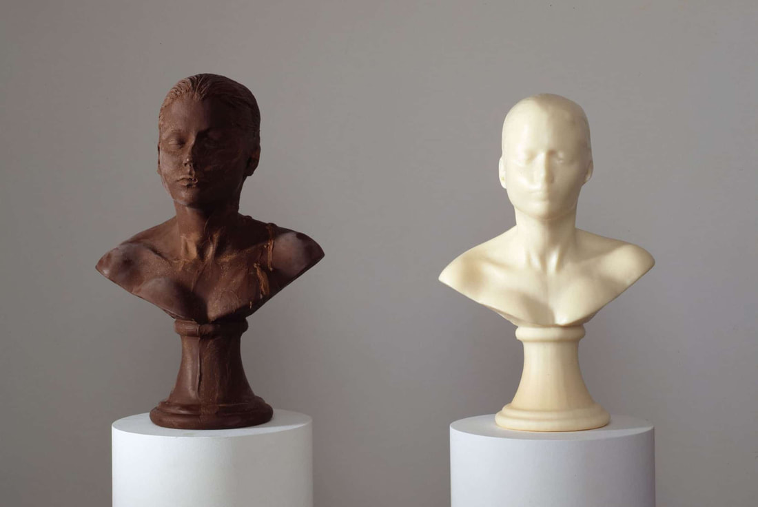
What Chadwick, Gallaccio and Antoni have in common (and how they differ from the above, male artists) is that chocolate forms the entirety of the piece - the be all and end all. It is not only the medium but also the concept that is on show. I believe that they have considered carefully its history, its use, its potent influence on today’s society and its metaphorical importance.
You Are What You Eat
The ad-man’s view of the female body
| From the time of Madame Sevigne (1600s), we have been bombarded by mixed reports on the ‘pros and cons’ of consuming chocolate. It seems that as soon as one point of view becomes over-expounded so another contrary way of thinking begins. Society is fickle and one of the things it is fickle about is the shape of the female body. (Men have somehow remained untouched by hype/public opinion and popular convention on size and appearance or at least to a lesser, negligible effect.) Since the 1960s with Jean ‘The Shrimp’ Shrimpton and Twiggy, fashion has had a lot answer for. In breaking new ground, designers are literally shaping the world through its promotion of the ‘perfect body.’ There is of course no such thing but there are certain ‘ideals.’ All this places an incredible pressure on impressionable young women and magazine and television images contribute to this pressure. One of the symptoms of this pressure has been the relatively new phenomenon of eating disorders. | “Twill make old women young and fresh create new motions of flesh” |
Bulimia Nervosa is where a person (usually a young woman) binges on exceptionally large amounts of food (usually high calorie foods like chocolate). She then goes through a process of purging the food (usually by vomiting or starvation).
Constant vomiting causes the stomach acids to eventually eat away the enamel on teeth, causes ulcers and stomach/bowel disorders. This lifestyle governs her every waking hour. Disgust and hatred of food are substitutes for disgust and hatred of the self.
Anorexia Nervosa is far more common in females than males and usually occurs in girls from families where high achievement and scholastic success are highly valued. It is this pressure from family, friends, media, everywhere which leads people to find solace elsewhere. The fear of failure to be accepted dominates her life. The calorie is one escape route. If a girl can control the calorie, and in turn the way she looks - her physical presence in the world, then she has at least succeeded in one thing and her body shape is the only thing that really matters to her at that time.
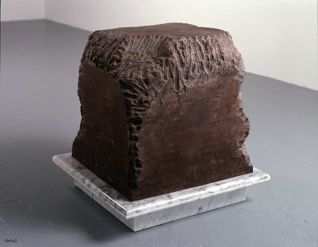
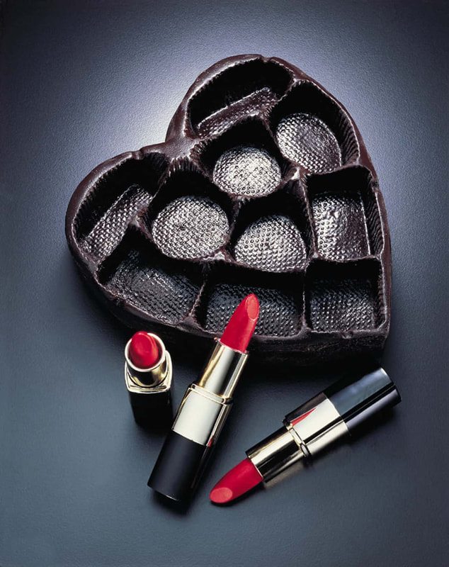
Her regurgitation of the chocolate from the ‘Gnaw’ block mirrors the bulimic’s purging activities. The act of modelling 45 heart shaped boxes from the spat is a comment on packaging (of chocolates and the inner ‘self’). The boxes look like well produced packaging trays - only when we know the truth behind their construction does the stomach turn.
Chocolate is a luxury item but has many positive and practical functions. It is a valuable portable snack food providing quick replenishment of energy (used by sportsmen and mountain climbers etc). And lastly, and most importantly perhaps, it is a gift. That is the double irony being dealt with in ‘Gnaw’. Antoni, the artist, through her processes, is providing heart shaped gift boxes for us, the gallery goer, the consumer.
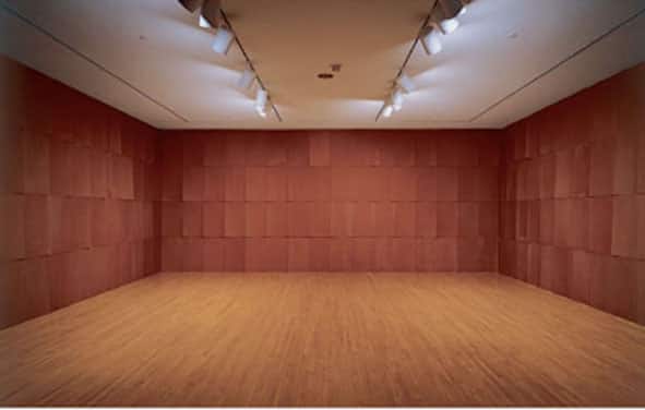
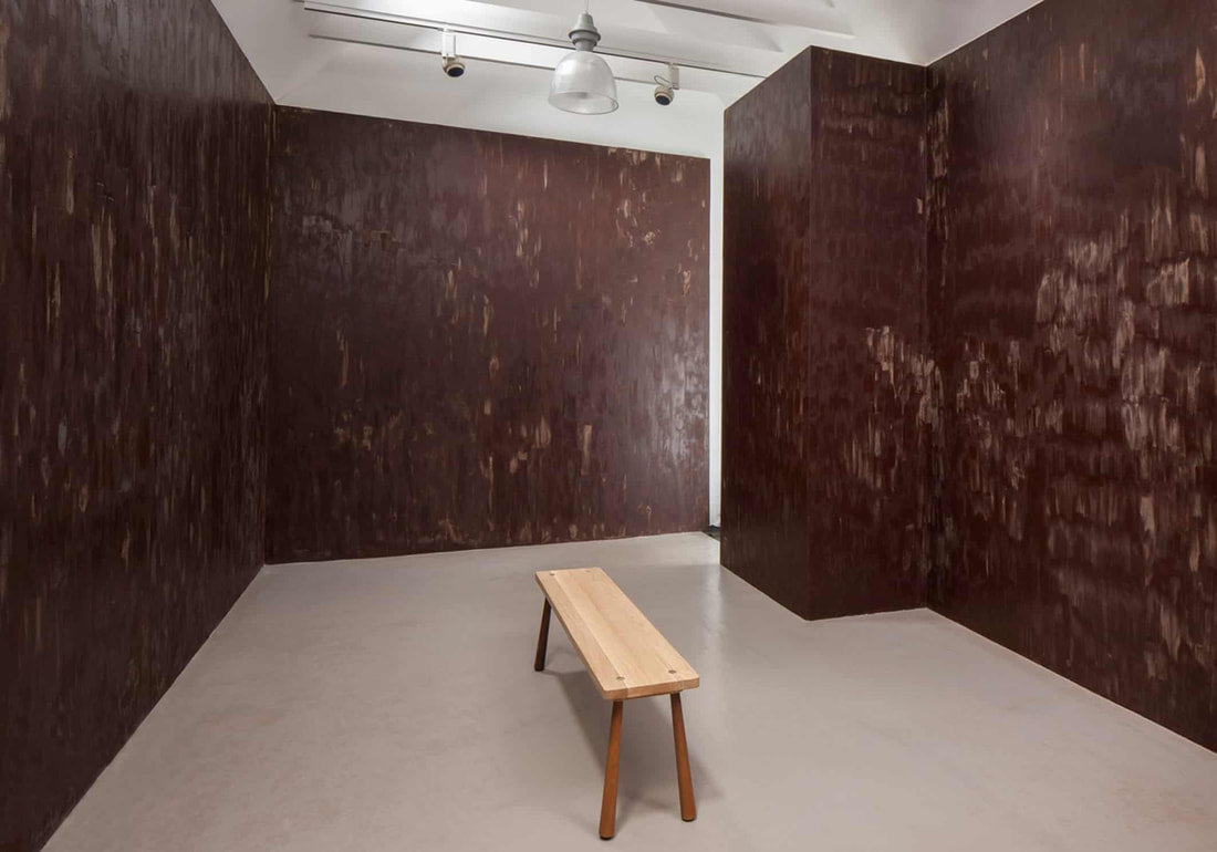
| Of course, eating is enjoyable, a pleasurable experience but 6001bs of it becomes a nightmare. Antoni answers this by doing exactly the same thing to a 600lb block of lard, this time the regurgitation becomes moulded into 400 lipsticks - again their beautiful production and packaging belies the vulgarity of their construction. In ‘Stroke’ (1994), Anya Gallaccio (b.1963) painted the walls of the Karsten Schubert Gallery in London with dark chocolate. In previous work she has left arrangements of flowers to wither and die. It is this transition from beauty to ugliness, growth to decomposition, life to death that is echoed in ‘Stroke.’ In all my work so far, the work only exists for a certain period of time and in a sense it only exists when it is being looked at.” |
“Excess is expression.” Gallaccio says:
“I’m completely addicted to chocolate, the idea of making a chocolate room should be something really heavenly and excessive...it has particularly female connotations of binging and desire.”
Its prime associations are with mortality, deterioration and putrefaction. Like Antoni, who literally eats away the chocolate herself, Gallaccio lets light, oxygen, water vapour and mold eat at the chocolate.
‘Stroke’ is essentially a light room made dark - subversive use of materials turns a familiar substance with all its associations with childhood and vibrancy into an excremental lament for loss. Gallaccio is using flowers and chocolate as triggers for associations such as love/ romance/sensuality/greed and satisfaction.
The notion of self disgust/self loathing is perpetuated by advertisers who are responsible for creating a generation of Kate Moss wannabes who are bombarded with the paradoxical image of the young beautiful slim girl tucking into a bar of pure indulgence and sin. The irony here is that neither is correct.
It’s like saying
Lipsticks make you beautiful and chocolates make you fat.”
About the author
He went on to work as a graphic designer at various leading agencies across the West Midlands and later on worked in secondary education for many years.
He runs his own graphic design business in Wolverhampton.
As a musician and song writer his music has been used in plays, films and on radio, TV and online. He has performed at gigs and festivals as a solo artist and in duets and rock bands and has supported Paul Young, All About Eve among many others.
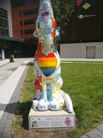
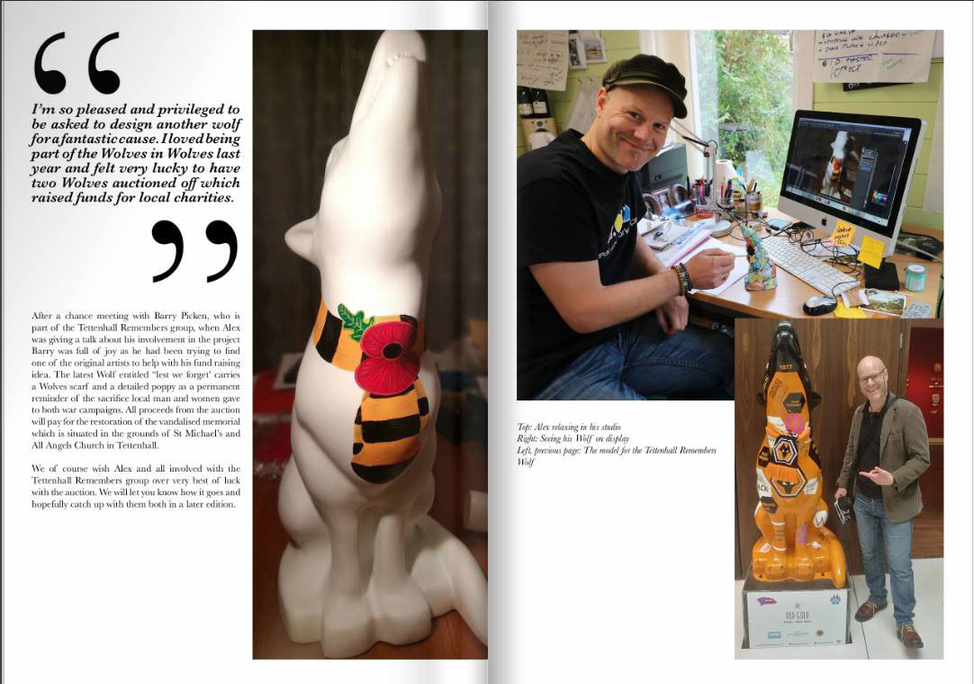
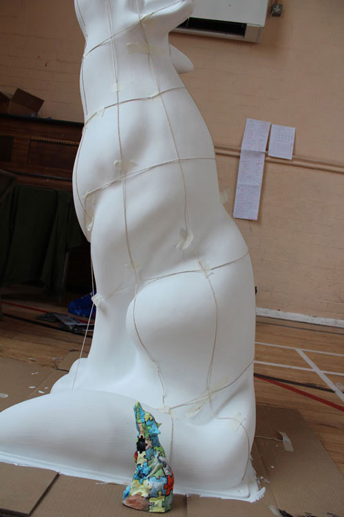
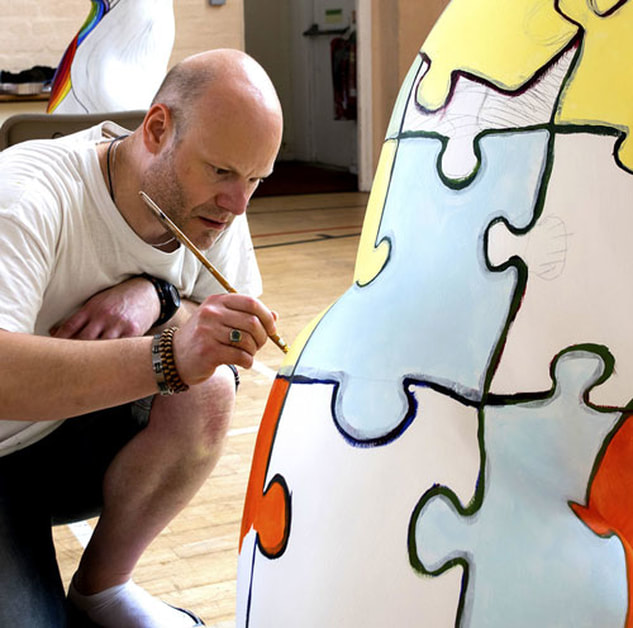
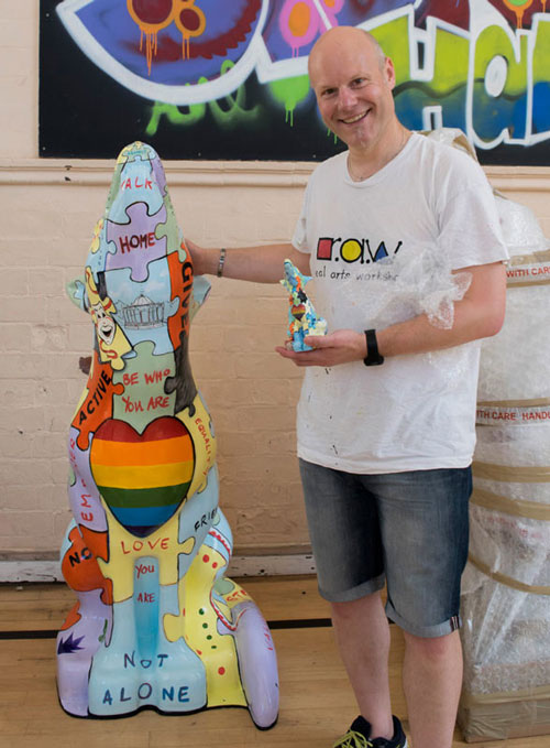
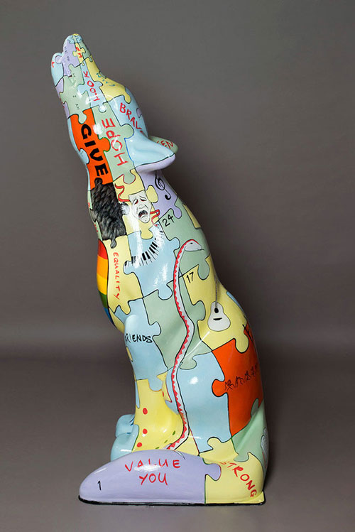
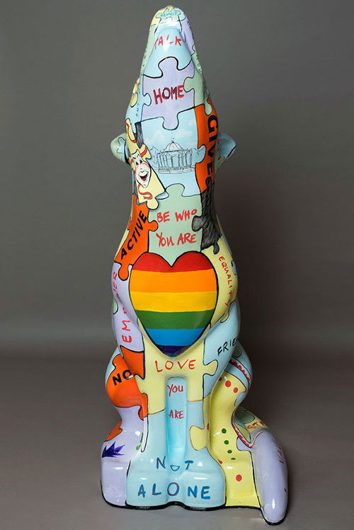
As a portrait artist he has been commissioned to create highly detailed paintings and pencil drawings for many years and painted a portrait of the 2016 Wolverhampton Mayor and his wife. He was a key artist on the ‘Wolves in Wolves’ public art project in 2017. He designed and painted two of the 30 5ft tall wolf sculptures: ‘Support Life’ and ‘Old Gold’. Support Life is now situated at University of Wolverhampton and Old Gold is located inside the Wolverhampton Wanderers FC Museum at Molineux Stadium.
He founded the company Real Arts Workshops (RAW) in the late 1990s following a final year university project and self publishing his own environmentally themed children’s book ‘Joseph The Useful Cardboard Box’ which went on sale in Waterstones bookstores across the country. RAW went on hold for many years as he explored other careers and was ‘re-booted’ in 2018 with his partner Gary to provide high quality and immersive arts experiences to various community groups; many of whom experience barriers to the Arts.
Gary is profoundly Deaf and Alex is qualified to level 6 in British Sign Language (BSL) and BSL is integrated into a lot of RAW’s work. They use the Arts to break down barriers, build confidence and encourage self esteem and well being.
Alex has a grown up daughter, Olivia.
Contact: [email protected]
Websites: www.alexvann.net
www.alexvanndesign.co.uk
www.realartsworkshops.co.uk
I designed and painted 2 5ft tall wolf sculptures: one called 'Old Gold' for Wolverhampton Wanderers Football Club featuring facts and figures about the club and one called "Support Life" about suicide prevention and mental well-being in association with University of Wolverhampton. You can scroll down this page to read an earlier blog post about the ‘Support Life’ wolf.
The workshops that I held with various groups for vulnerable people (see various logos below) led to me reforming my community arts workshops company which you can visit here: Real Arts Workshops.
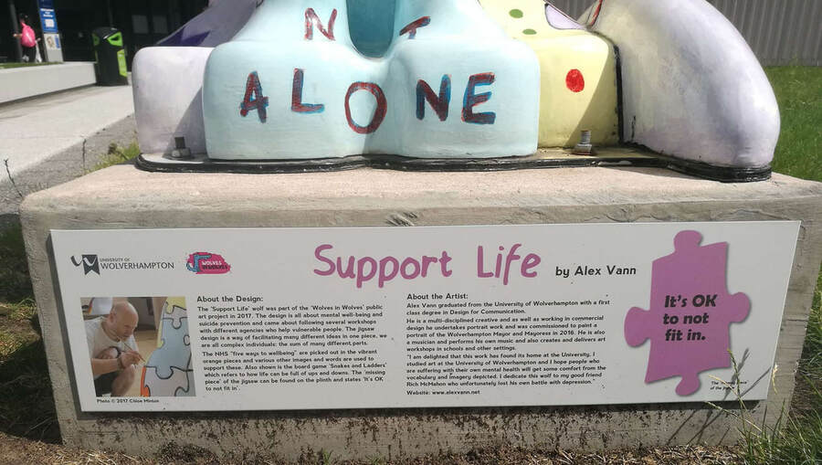
One of the things that was important to me was that the story behind the wolf was told via the dibond panel attached to the plinth.
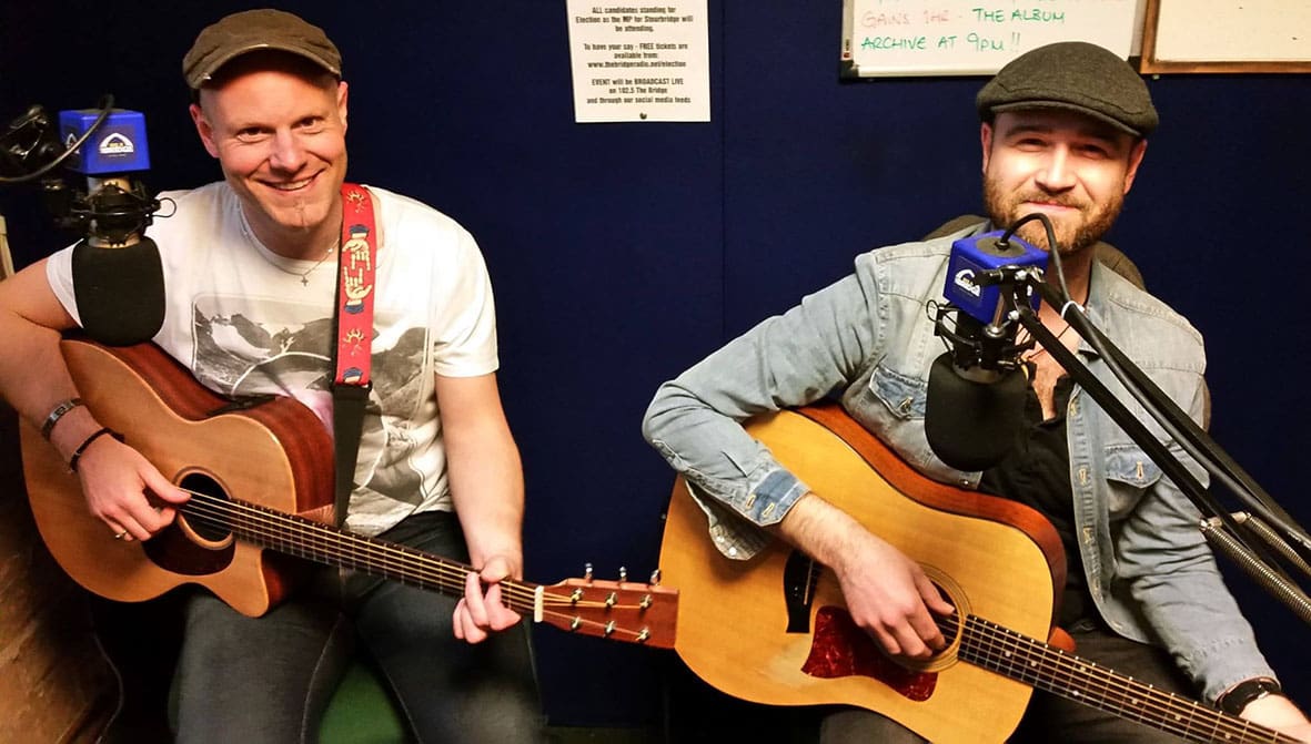
| My good friend and previous musical partner Rich McMahon lost his own battle with depression in 2015. We worked together in a musical partnership for a number of years including on his show Beyond Borders touring the village halls around the Midlands and performing an eclectic mix of folk, pop and rock songs, covers and original, telling the story of how music can break down barriers. When I learnt that Rich had taken his own life it had a profound effect on me. Why didn’t he speak to me about his struggles? I’ve been there myself so I could empathise and maybe avert a disaster but then I never spoke to him about my own issues. So many questions came to me and a terrible feeling of things being left undone. We never wrote a song together, we didn’t do any studio recordings together we had so much more work to do. |
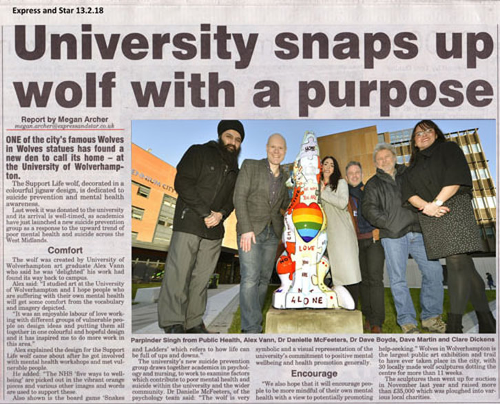
When Support Life was installed at University of Wolverhampton early in 2018, I noticed that the information panel wasn’t there. It bothered me that Rich’s name was missing when he’d been so important in the thought process behind the wolf design and painting. So I designed a new information panel and got in touch with the University about getting it installed. David Wedge from the Alumni office was really supportive throughout and I’m pleased to say the panel is now in place on the plinth and I hope people take the time to read about it.
You can read the issue here: Zero Degrees Issue One. It features many local Wolverhampton business owners and personalities including Jody Craddock, DJ Janos, Alex Is, Mel Eves and of course me!
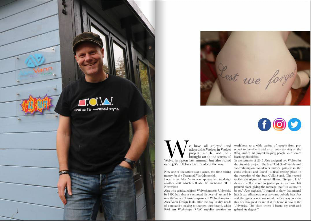
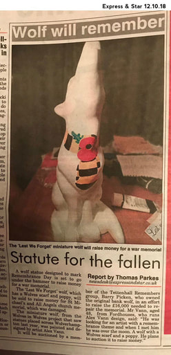
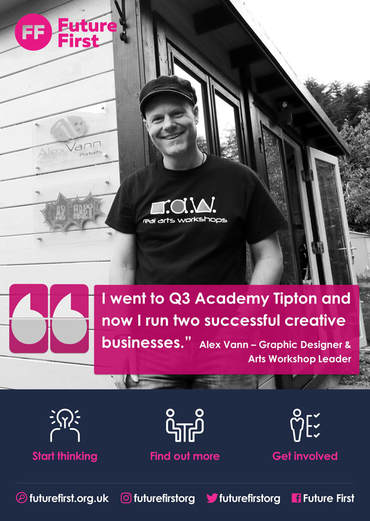
| There was also a feature in Express and Star about a Wolves in Wolves design I did recently for Tettenhall Remembers. | And I feature on a poster for Future First which is designed to inspire students at my old school! Now called Q3 Academy Tipton. |
I'd admired several similar art projects in previous years: 'The Big Hoot' Owls in Birmingham, the Gorillas of Norwich and of course Liverpool's Superlambananas (and, later on, Penguins) and always thought it would be great to get to design and paint a sculpture such as this, so this is a case of a dream becoming a reality.
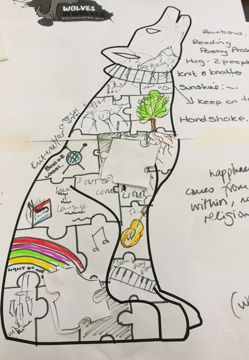
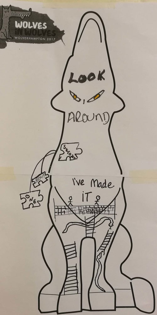
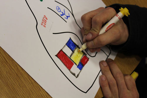
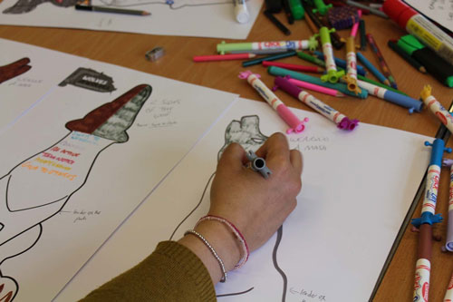
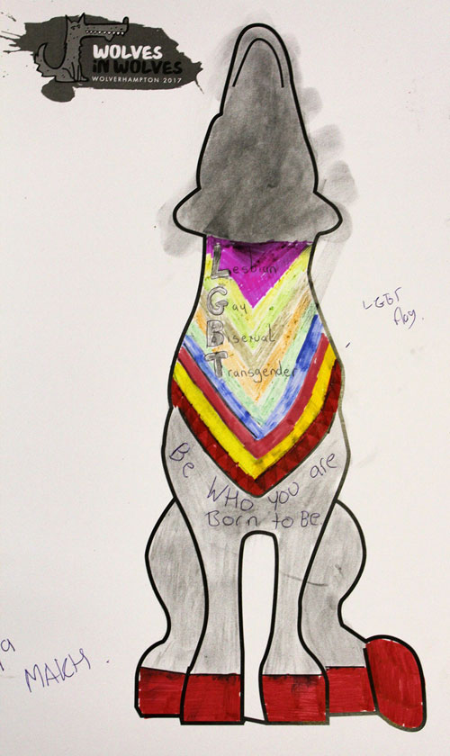
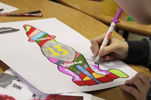
My brief was to design and paint the suicide prevention and mental-wellbeing wolf. Part is this brief was to hold art workshops with different agencies who deal with people at risk of suicide: P3, Haven, Papyrus : prevention of young suicide and Base 25, to get their ideas about what design should go on the wolf.
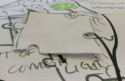
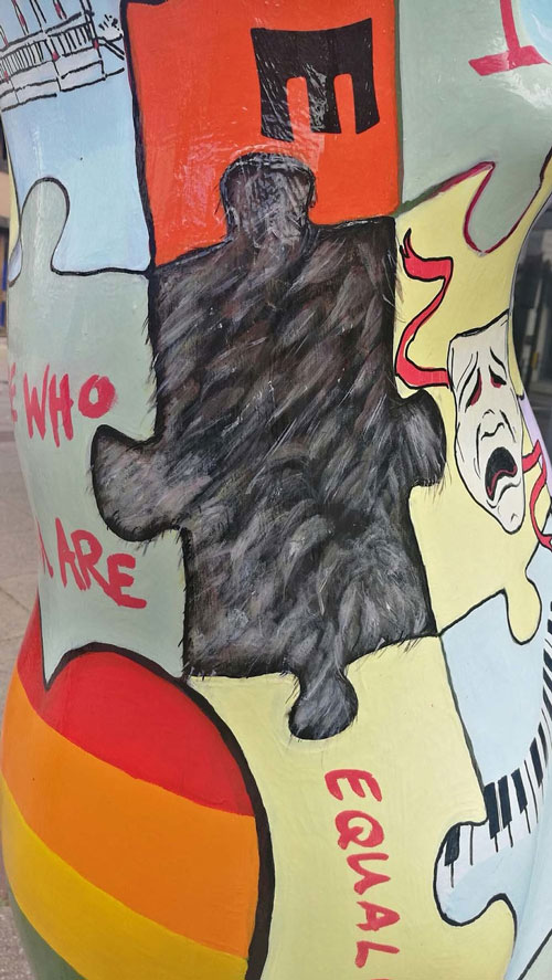
Also early on I knew that not all the pieces would be in place and actually one of them might be missing.
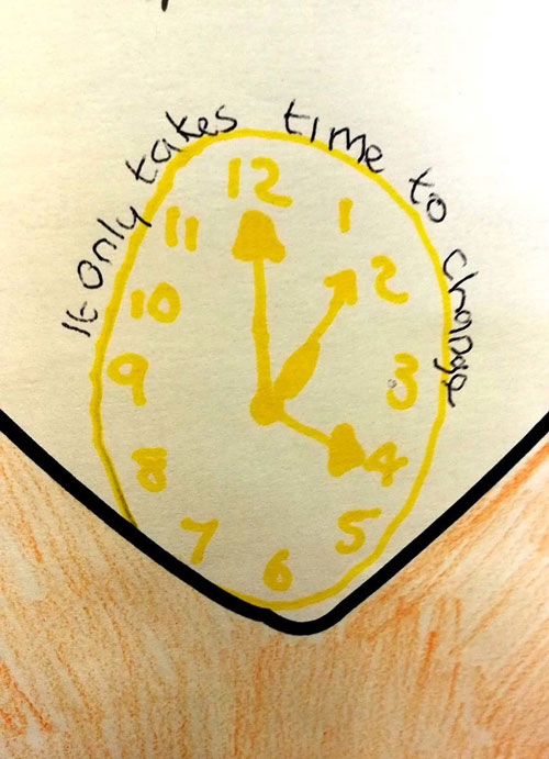
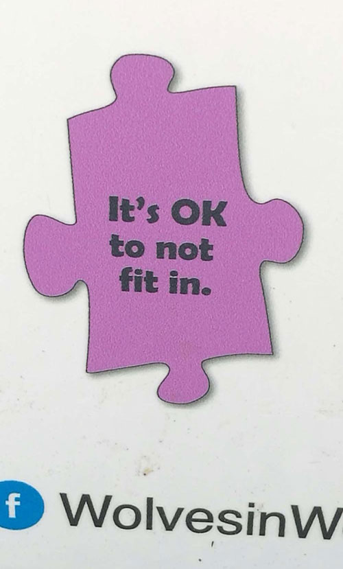
What was coming out of the workshops was this notion of people feeling disenfranchised and unable to talk about feelings. I thought it was important that the design address that, as well as other issues that came up.
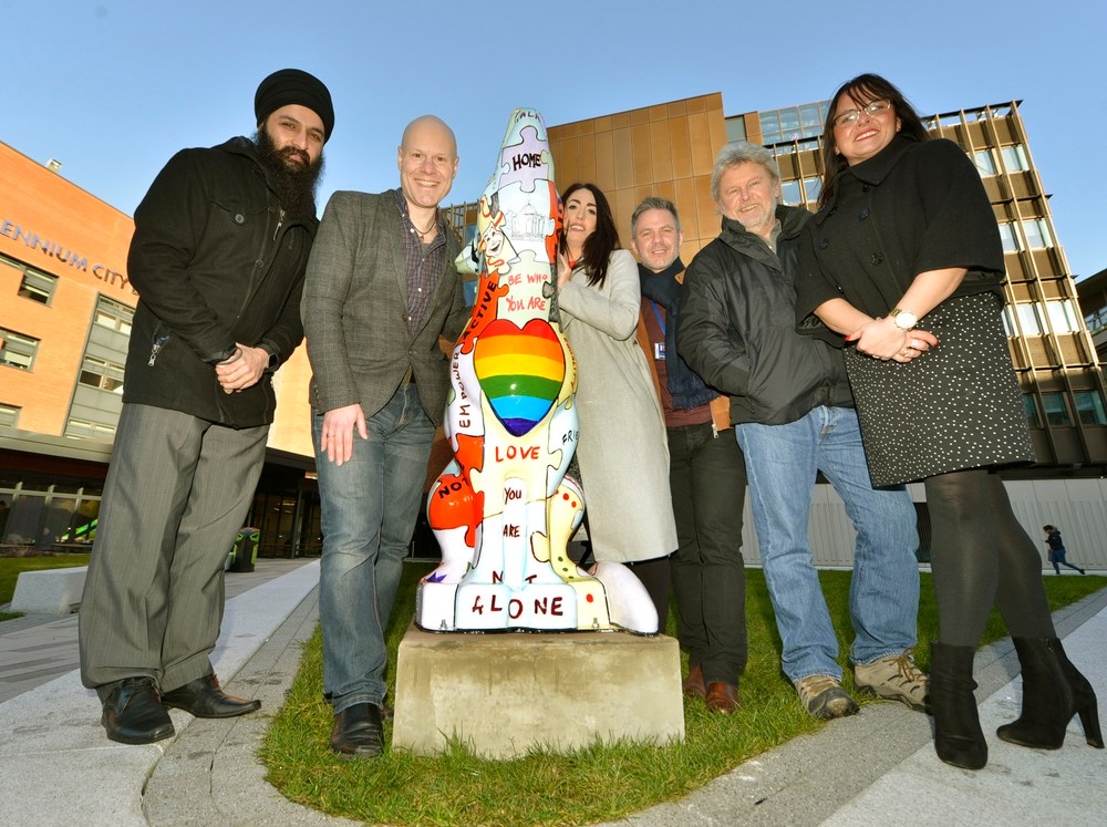
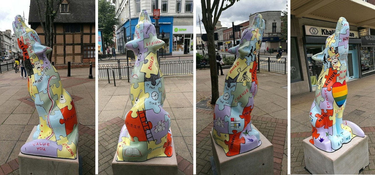
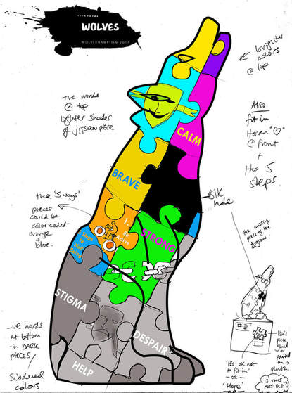
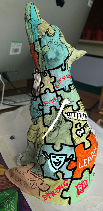
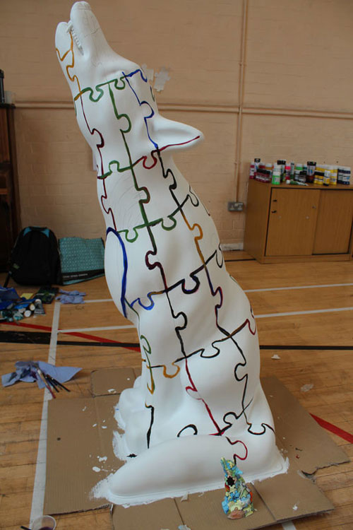
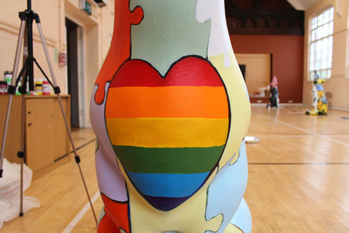
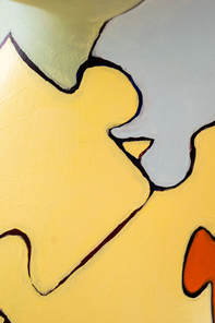
The design for this wolf came about following several workshops with different agencies. The jigsaw idea relates to how different aspects of life make up a whole person.
The five ways to mental well-being are picked out in the vibrant orange pieces and other imagery and words are used to support these.
Also shown is the board game ‘Snakes and Ladders’ which refers to how life can be full of ups and downs. The ‘missing piece’ can be found on the plinth.
Alex dedicates this wolf to the memory of his good friend Rich McMahon.
In Wolverhampton, between 2013-2015, 66 people ended their life by suicide. The majority of these 66 were men, a trend which is seen across the country and abroad.
Organisations’ and services across the city of Wolverhampton recognise the importance of taking proactive action to prevent suicide because suicide is preventable. In Wolverhampton, groups have come together to form the Suicide Prevention Stakeholder Forum. Coordinated through the Public Health and Wellbeing Team within the City of Wolverhampton Council, the forum is independently chaired and consists of a range of organisations from statutory, education and third sectors. Together the forum has undertaken a needs assessment on which basis a strategy and an action plan has been formed.
In January 2018 'Support Life' was relocated to Wolverhampton University.
Author
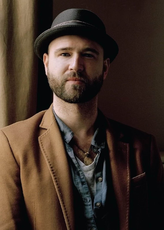
Alex Vann is a true all round creative. As well as owning Alex Vann Design he is the founder of the community arts group: Real Arts Workshops, a portrait artist and a gigging musician.
Archives
November 2021
May 2021
January 2021
April 2020
August 2019
January 2019
November 2018
August 2018
July 2018
Categories
All
Access To Business
Advert Design
Advertising
Alzheimer's
Alzheimer's Day
Anya Gallaccio
Art
Banner Stands
Best Practice
Billy Spakemon
Black Country
Black Country Museum
Board Games
Book Design
Books
Branding
Business Cards
Business Needs During Covid
Business Stationery
Cadburys
Charity
Charlie Grigg
Chocolate
Claes Oldenburg
Comics
Corporate Identity
Covid 19
Dementia
Design
Digital Illustration
Drawing
Eating Disorders
Edward Ruscha
Fabric Design
Fliers
Graphic Design
Graphics
Helen Chadwick
Hints And Tips
Illustration
Janine Antoni
Joseph Beuys
Large Format
Leaflets
Logo Design
Logos
Marketing
Mental Well Being
Mental Well-being
Online
Packaging Design
Painting
Paul McCarthy
Pencil Drawing
Portrait Art
Portraits
Public Art Projects
Pull Up Banners
Signage
Suicide Prevention
Thesis
Vascular Dementia
Vehicle Graphics
Vehicle Livery
Video Conferencing
Vulnerable Adults
Web Design
Websites
Wolverhampton
Wolverhampton City Council
Wolverhampton Suicide Prevention Stakeholder Forum
Wolverhampton University
Wolves In Wolves
Workshops





 RSS Feed


